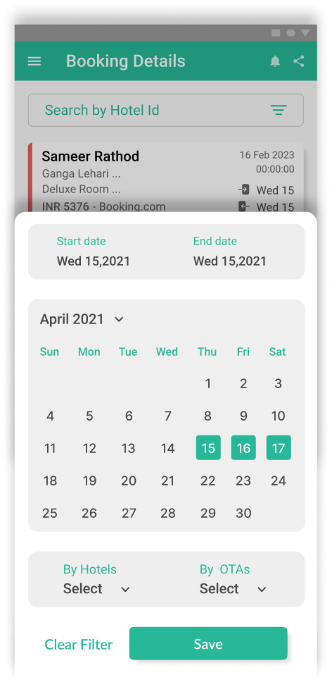
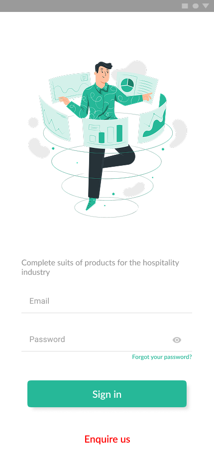
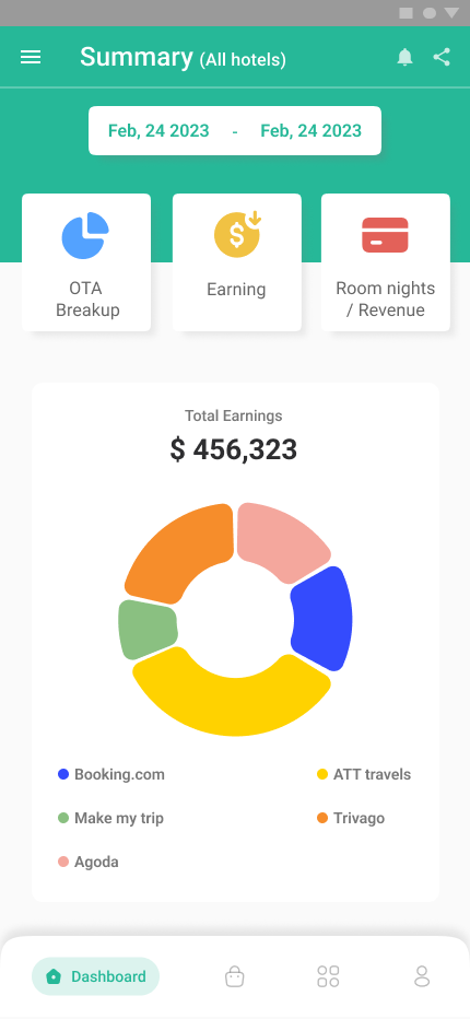
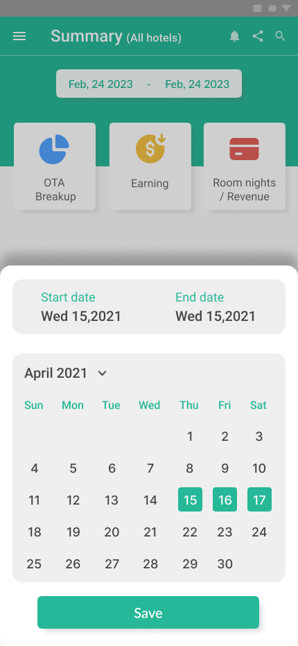
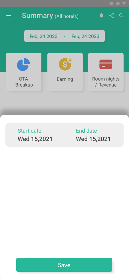
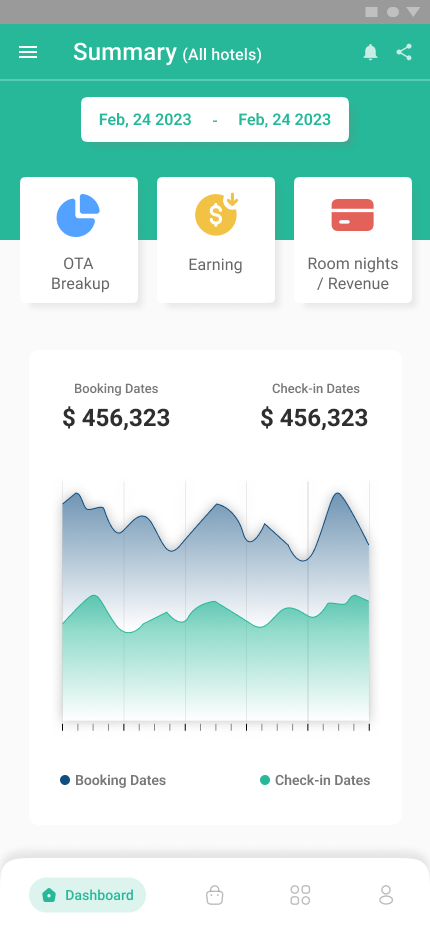
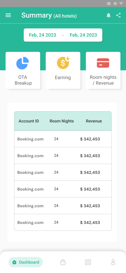

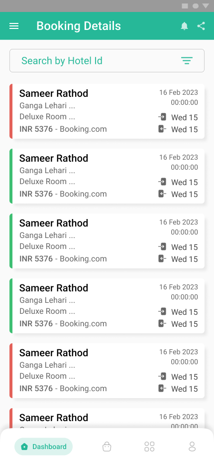
Untangling enterprise workflows for faster hotel operations.
AxisRooms simplifies years of accumulated complexity by streamlining navigation, reducing workflow friction, and helping hotel teams manage revenue and distribution with confidence from anywhere.
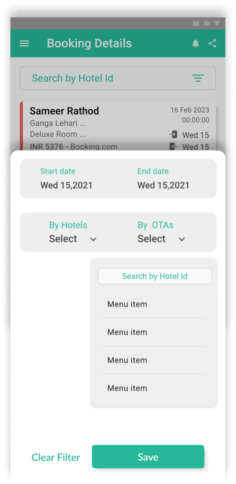
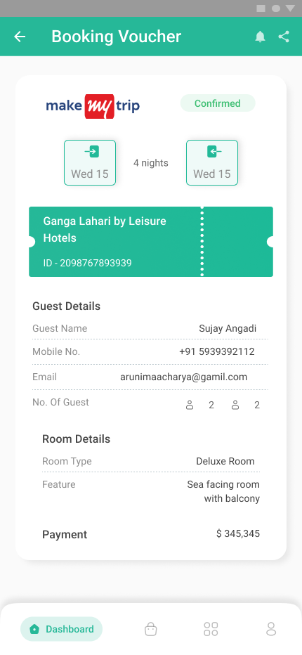
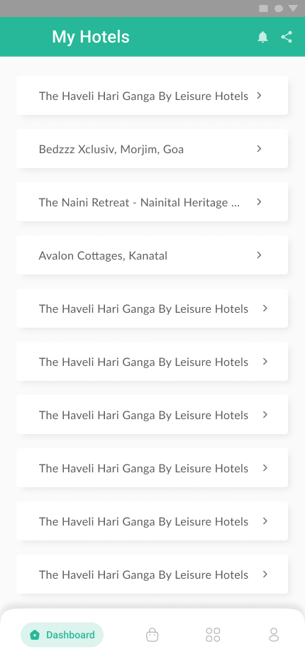
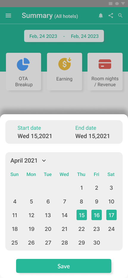
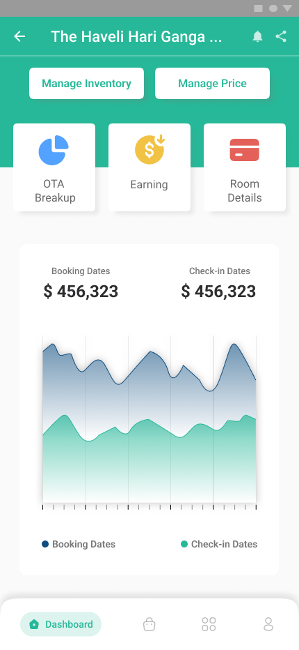
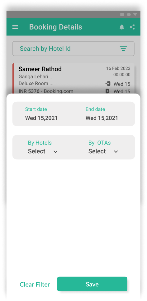
Project Snapshot
Built from scratch at Hotelogix.
A look at the scope, team, and contributions that shaped Pocket PMS from the ground up.
Foundation
The foundation
Before diving into the design process, here's what AxisRooms is, why it was redesigned, and the impact it aims to create.
What is AxisRooms?
AxisRooms is a channel manager — a hotel distribution and revenue management platform that helps hotels manage inventory, room rates, reservations, and online distribution across multiple booking channels from one place. Unlike traditional PMS software, AxisRooms focuses on helping hotels maximize occupancy and revenue while keeping inventory synchronized across OTAs.
Who uses it?
Hotel Owners, Revenue Managers, Reservation Managers and Multi-property Operators all rely on AxisRooms. Each role performs different operational tasks but shares the need for fast, reliable workflows.
Why redesign it?
Over the years, the platform evolved through continuous feature additions. While functionality expanded, navigation became increasingly fragmented. Users often reached the same destination through multiple paths, making everyday tasks unnecessarily confusing. Our goal wasn't to redesign features. It was to redesign how people reached them.
Business goal
Modernize the mobile experience, reduce navigation complexity, increase operational efficiency, and create a scalable foundation for future features.
The Opportunity
There's a better way to run hotel operations.
Enterprise software shouldn't make users remember where features live. By simplifying navigation and surfacing the most important actions, the experience becomes faster, more predictable, and significantly easier to learn. Instead of adding new capabilities, the opportunity was to make existing ones effortless.
Information Architecture
Rebuilding the product's mental model.
Rather than redesigning isolated screens, we restructured how the application was organized. Related actions were grouped together, duplicate entry points were removed, and navigation was rebuilt around user goals instead of product modules.
Multiple duplicated branches
One clear hierarchy
My Approach
Designing workflows—not screens.
The redesign focused on making operational tasks easier to complete rather than making individual screens look better.
Every decision was guided by three questions: Can users find it? Can they understand it? Can they complete it quickly?
One clear path
Every task was rebuilt to have a single, predictable route instead of several overlapping ones.
Reduce cognitive load
Grouping related actions together meant users no longer had to remember where features lived.
Action-first
The most common actions were surfaced immediately instead of buried behind menus.
Consistency
The same terminology and interaction patterns were used everywhere in the product.
Workflow Transformation
From seven paths to one.
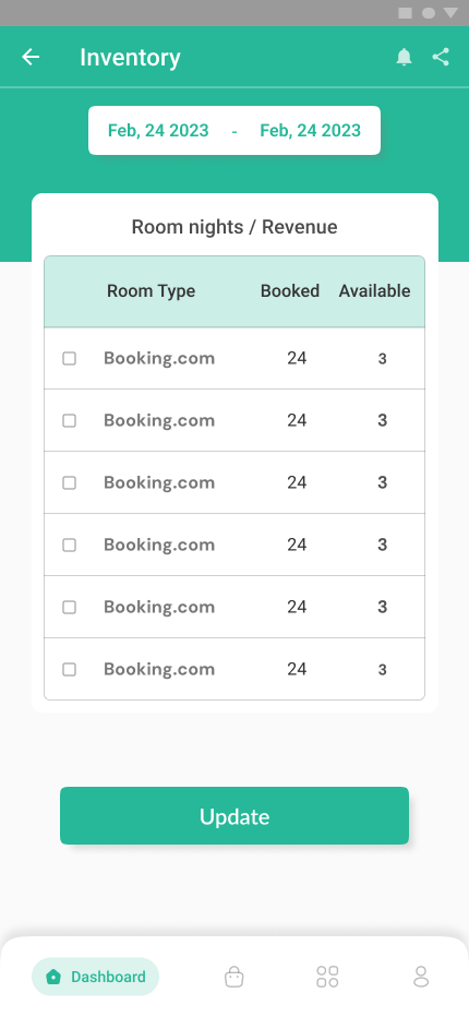
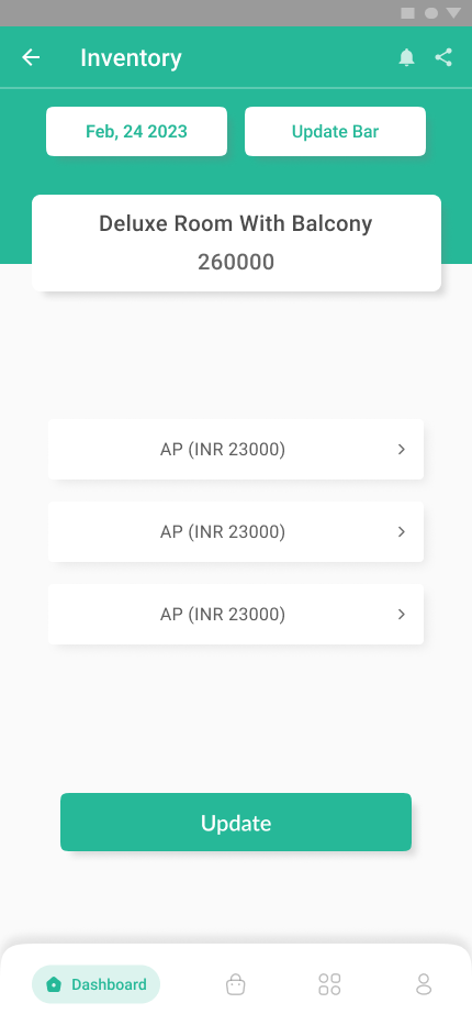
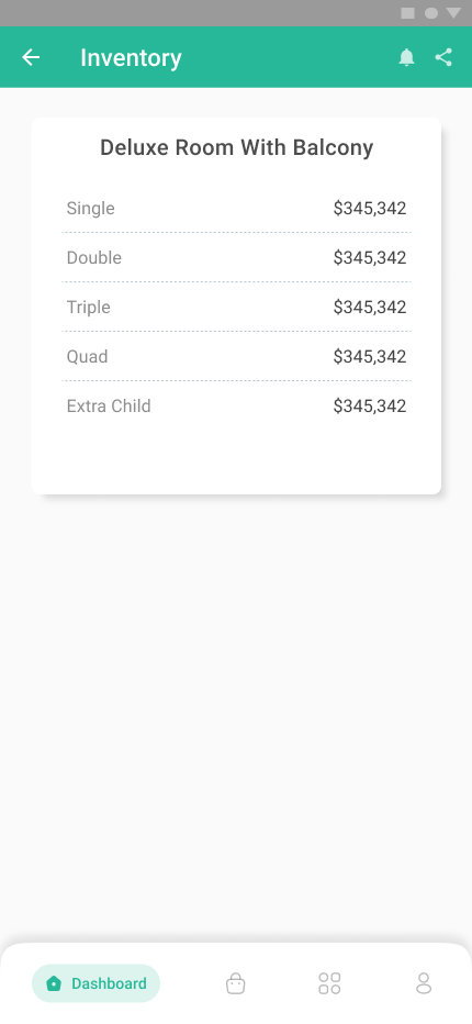
One of the most common issues across the product was duplicated navigation. For example, Inventory could be accessed from several different menus depending on where users started.
Although flexible, these overlapping paths created uncertainty and slowed down everyday operations. We consolidated workflows into a single, predictable path while keeping the same functionality intact.
Design System
Building better interfaces with design systems
To ensure consistency across the product, we developed a reusable mobile design language that standardized typography, spacing, color usage, interaction patterns, and reusable components. The system made future feature development faster while creating a more cohesive experience for users.
Challenges
Simplifying without removing power.
Enterprise products naturally grow more complex over time. The challenge wasn't deciding what to remove—it was reorganizing existing functionality into workflows that felt intuitive while preserving the flexibility experienced users relied on.
More work
Other case studies
View all →Get Started